Research Project UDT GHG User feedback Developer Bio
Instructions on how to use UDT-GHG Dashboard
Instruction Video
There are two scenes that users can set using the dashboard’s top-left drop-down button.
- Scene 1 (default) : GHG emissions - users can view operational ghg emissions and electricity consumption trends for built environment in Singapore.
- Scene 2 : Potential for Intervention - users can run analysis to find buildings which need rejuvenation of building systems and an intervention from stakeholder towards decarbonisation pathway. Using weighted sliders, users can prioritise necessary parameters for decision-making of an intervention.
UDT-GHG Dashboard - Scene 1
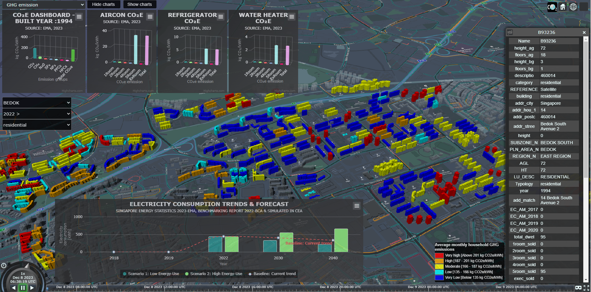
The dashboard image below shows an example of Scene 1, with operational GHG emissions of buildings shown in a heat map (Red=very high GHG values and Blue=very low GHG values). The GHG inventory along with equipment-based-emissions for individual buildings (on-left-click) is shown on the top-left of dashboard. Electricity consumption trends at the bottom of the dashboard and metadata (right) with simulation results and information collected (building property, land-use, planning area, energy-use etc.) from open sources.
Methodology for calculating building operational greenhouse gas (GHG) emissions
The operational GHG emissions (Og) of buildings (CO2e/kWh-carbon dioxide equivalent per kilowatt hour) are calculated using a linear equation:
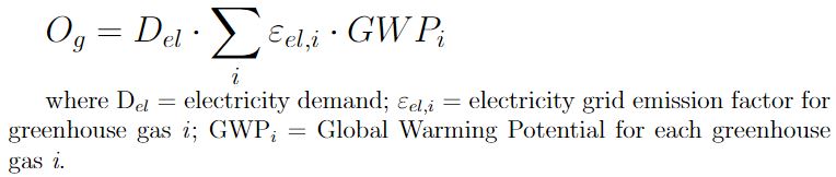
Electricity demand (Del) in kWh (kilowatt-hours) by average values indicated in energy statistics reports, national benchmarking reports or results from a simulated energy demand model (CEA) or actual meter reading.
The electricity grid emission factor is the average amount of CO2 that each grid-connected power unit emits per unit of net electricity produced in the system (Energy Market Authority-EMA’s yearly Singapore energy statistics report provides the emission factor for Singapore).
The Global Warming Potential (GWP) for each of the seven major GHGs [carbon dioxide (CO2), methane (CH4), perfluorocarbons (PFCs), hydrofluorocarbons (HFCs), sulfur hexafluoride (SF6), nitrous oxide (N2O), and nitrogen trifluoride (NF3)], compares the contribution of a given mass of a GHG to that of CO2 in terms of global warming over a definite time frame (for instance, 100 years). The GWP values for the most common GHGs (CO2, CH4, N2O) can be found in the Intergovernmental Panel on Climate Change (IPCC) report.
Potential for Intervention Map (Scenario - Year 2040) : Public housing (HDB) priority for low-carbon building systems rejuvenation
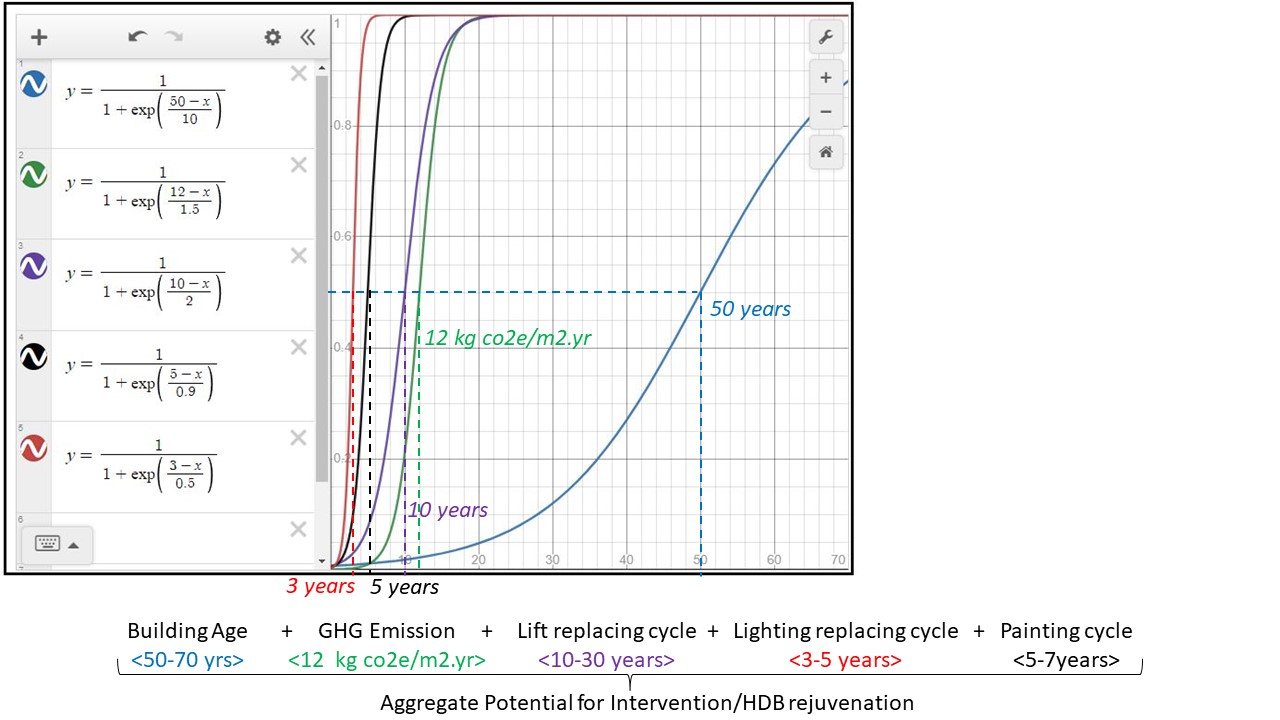
The Potential for Intervention (PFI) map is created using Multiple-Criteria Decision Analysis (MCDA). The PFI map helps decision-makers prioritise low-carbon building system rejuvenation in Singapore public housing. The resulting PFI heat map generated shows the buildings that need urgent rejuvenation based on five parameters assigned. PFI analysis parameters are 1. Building age, 2. Greenhouse gas (GHG) emissions, 3. Replacement cycles for lifts and 4. Replacement cycles for lighting equipment and 5. Building wall painting cycles. These parameters have varying scales and hence normalisation (to a notionally common scale) using a sigmoid function is required to aggregate parameters. Before aggregating, each parameter is converted to a 0 to 1 value using Sigmoid function, midpoint (0.5) for each parameter is defined as per threshold beyond which there is a need for an intervention from decision maker (see Figure below with Normalisation step). For instance, the Building age parameter is assigned a threshold of 50 years, beyond which maintenance is required. Similarly, public housing has set certain thresholds for replacement cycles of building equipment used (such as lifts and lighting).
Normalisation of parameters of varying scales using the sigmoid function:
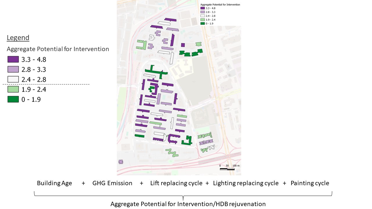
After the normalisation step, each parameter is aggregated to find the Potential for Intervention (the higher the value, the more the PFI). The result of the aggregate potential for intervention with each parameter of the same weightage assigned (1) (see Figure below with PFI map). The dashboard uses this method to generate PFI for users, additionally, it gives users an option to change the weightage of parameters based on their priority and the dashboard intuitively creates a PFI map with newly assigned weights. Once the PFI is generated, users can examine buildings with higher PFI values to plan an intervention.
Aggregate Potential for Intervention after Normalisation:
PFI was calculated for buildings with equal parameter weightage (1) and with quantile distribution (equal probability). A sample of the PFI analysis result is shown below.
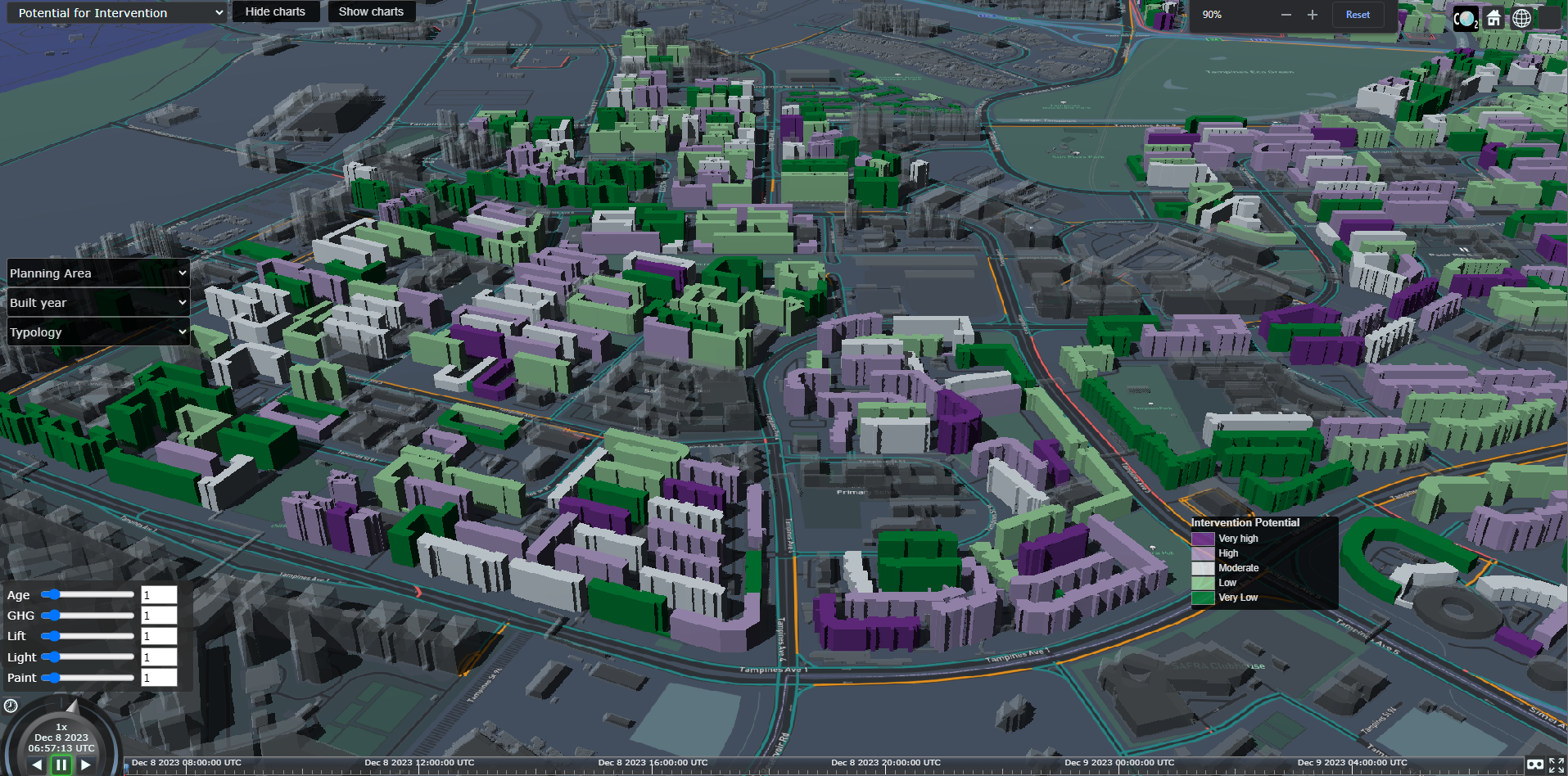
UDT-GHG Dashboard - Scene 2
The dashboard image below shows an example of Scene 2, with potential of intervention analysis shown in a heat map (Purple=very high PFI values and Green=very low PFI values). Users can input weightages to the parameter using the slider (left-bottom) on the dashboard. By default, parameter weightages on the slider assigned to generate PFI maps are set to 1. Users may assign weightage based on their priority.
User Task:
Try to find residential buildings that need rejuvenation in 2040 in the Planning Area with HDB estates (eg: Queenstown, Punggol, Tampines etc.), keeping reducing GHG emissions as a priority.
Conclusion:
-
The UDT-GHG dashboard and PFI analysis help decision-makers prioritise and plan low-carbon building systems rejuvenation.
-
This research will increase the demand for more environmental consideration from stakeholders during rejuvenation.
-
There is currently no cap on GHG emissions in the Built Environment sector. The research will help develop operational GHG emissions accounting standards, emission limits, decarbonisation planning, and climate resilience.